 Set-up Pack
 Launch Pack
 Grow Pack
7 E-Commerce Websites with the Best Website Aesthetics in 2024
Whether you're a budding entrepreneur eager to launch your online store or a seasoned designer looking for fresh inspiration, these 7 e-commerce websites with the best website aesthetics will provide valuable insights into the art of crafting visually appealing and commercially successful e-commerce platforms.

In the bustling world of online shopping, the aesthetic appeal of an e-commerce website is not just about looking good—it's a vital part of captivating shoppers and converting browsing into sales. As we advance through 2024, the visual impact of a website has become increasingly significant in distinguishing top-performing brands from the rest. A well-designed website doesn't just display products; it offers an immersive experience, communicates brand values, and establishes emotional connections with its visitors.

In this competitive landscape, businesses that prioritize innovative design and user-friendly interfaces are the ones that stand out. From minimalist layouts that soothe the eye to vibrant, bold themes that energize shoppers, the aesthetics of a website can dramatically influence consumer behavior and brand perception. In this feature, we explore 7 e-commerce websites that are leading the charge in 2024, breaking down exactly what makes their aesthetics influential, memorable, and most importantly, effective in driving engagement and sales.
Join us as we delve into each site's design elements, from layout and color schemes to typography and interactive features, and see how they contribute to a superior user experience. Whether you're a budding entrepreneur eager to launch your online store or a seasoned designer looking for fresh inspiration, these examples will provide valuable insights into the art of crafting visually appealing and commercially successful e-commerce platforms.
Looking for tools to build your e-commerce website?
Before we proceed, here are some other guides you might like:
1. E-commerce Motivation: Quotes and motivational content to help you through your e-commerce journey.
2. Trending E-commerce Products: Trending product recommendations for your e-commerce store.
3. ChatGPT Prompts for E-commerce: ChatGPT prompts for every stage of building your e-commerce store.
Section 1:
Website #1 - Vinyl Collector: A Symphony of Colors and Nostalgia
Website: www.vinylcollector.store
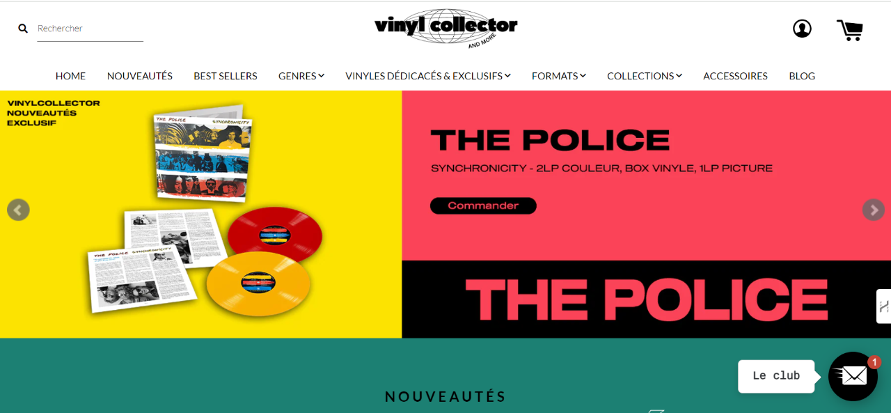
In the dynamic realm of e-commerce, Vinyl Collector stands out as a beacon for music enthusiasts, particularly vinyl record collectors. The website employs a bold, color-block design that echoes the vibrancy and eclectic appeal of vinyl culture. The homepage greets visitors with a striking pink background that not only captures attention but also sets a playful, retro tone consistent with the nostalgia associated with vinyl music.
Design Elements
- Color Scheme: Vinyl Collector uses a vivid palette that includes deep blues and bright pinks, creating a visually stimulating experience that reflects the energy of the music industry.
- Typography: The site utilizes modern, sans-serif fonts that are both easy to read and stylistically fitting with its contemporary layout. This choice maintains readability and aesthetic appeal across devices, crucial for a site targeting a diverse age group.
- Interactive Elements: One of the site's standout features is its interactive album previews. Users can hover over album covers to see additional information, a feature that not only enhances user engagement but also mimics the tactile experience of flipping through records in a physical store.
User Experience
The website’s user interface is meticulously organized despite its vivid design. Navigation is intuitive, with clear categories and a search bar prominently positioned at the top. This ensures that users can easily explore and discover new additions without feeling overwhelmed by the choices.
Unique Features
- Featured Albums: The main banner showcases featured albums, rotating prominently on the homepage. This not only highlights special editions or new releases but also serves as a gateway into deeper dives into the music world.
- Visual Storytelling: Each album cover is presented not just as a product but as a piece of art, contributing to the site's gallery-like feel. This approach appeals to collectors and casual listeners alike, offering a visually rich experience that enhances the appeal of each product.
Vinyl Collector’s website does an excellent job of blending aesthetic appeal with functional design, creating an inviting space for music lovers to explore and purchase vinyl records. Its design not only respects the legacy of vinyl but also elevates it to meet the expectations of today’s digital shoppers, making it a prime example of excellent e-commerce aesthetics in 2024.
Section 2:
Website #2 - Salty Crush: Effortlessly Chic and Feminine
Website: www.saltycrush.store
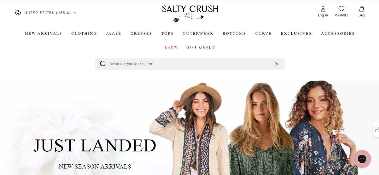
Salty Crush embraces the essence of bohemian charm and modern femininity, creating a visual feast for fashion lovers. This e-commerce site captures the free-spirited aesthetic with its use of soft pastels, flowing lines, and a clean, airy layout. It's not just a store; it's a portrayal of a lifestyle that appeals to women who celebrate freedom, comfort, and elegance in their fashion choices.
Design Elements
- Color Palette: The site uses a soft and neutral background that allows the vibrant colors of the clothing to stand out. This subtle contrast creates an inviting and calm shopping environment, encouraging visitors to browse with ease.
- Imagery: High-resolution images dominate the homepage, featuring models in dynamic poses that highlight the clothing’s movement and texture. This not only showcases the products effectively but also tells a story of wanderlust and adventure.
- Layout: The layout is fluid and intuitive, with seamlessly integrated navigation that complements the site's stylish aesthetic. The use of whitespace is particularly effective, promoting an uncluttered and focused user experience.
User Experience
Navigation on Salty Crush is exceptionally user-friendly, with well-categorized menus and a visible search bar that aids in quick browsing. Product pages provide detailed descriptions and styling tips, enhancing the shopping experience by helping customers envision how items might look in their own lives.
Unique Features
- Lookbook Integration: Salty Crush includes an interactive lookbook, which not only serves as a catalog but also as inspiration for shoppers. This feature allows customers to see how items can be styled together, promoting larger purchases and customer satisfaction.
- Social Proof: Customer reviews and photos are prominently displayed, providing social proof and fostering a community around the brand. This transparency builds trust and helps potential buyers make informed decisions.
Salty Crush's website is a testament to how e-commerce platforms can transcend traditional online shopping by offering an immersive brand experience. Its aesthetic perfectly captures the essence of its target market—women who love stylish, comfortable, and expressive clothing. This successful integration of design and functionality makes it a prime example of excellent e-commerce aesthetics in 2024.
Section 3:
Website #3 - The Refill Jar: Embracing Sustainability with a Clean and Functional Design
Website: www.therefilljar.store
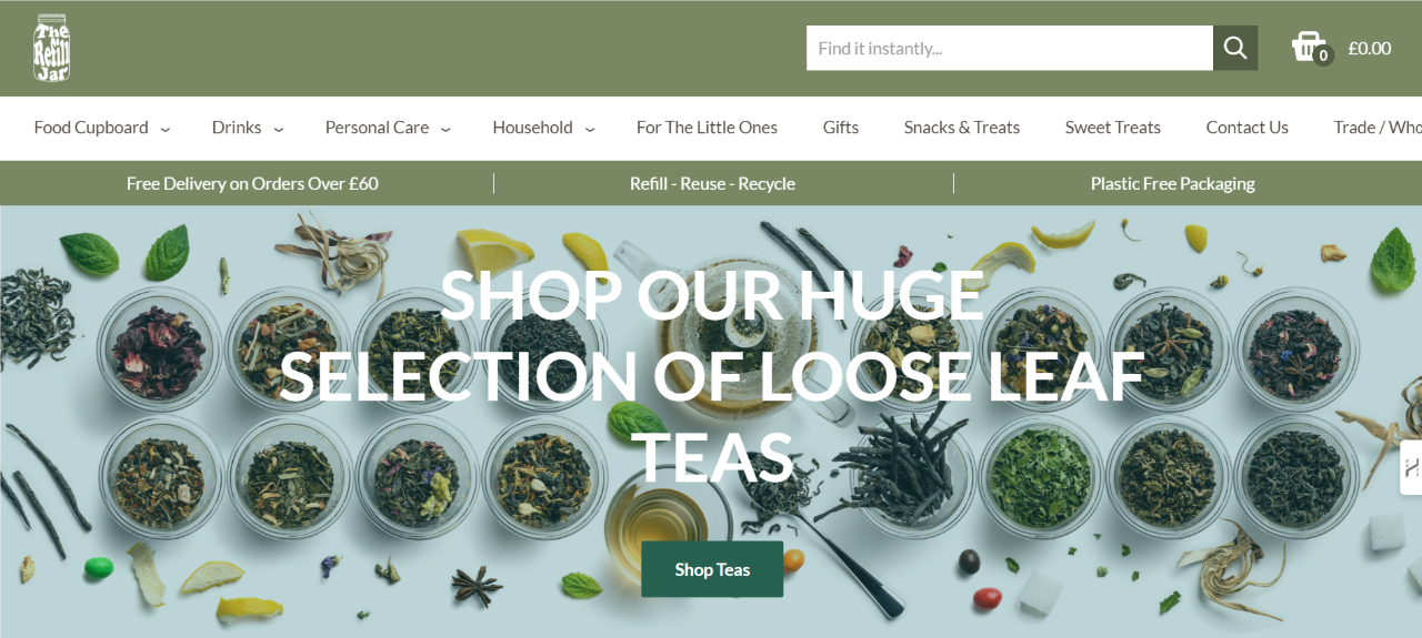
The Refill Jar's e-commerce platform brings the ethos of zero waste to the forefront with its clean, functional design, mirroring the brand’s commitment to sustainability and eco-friendliness. This site specializes in offering a variety of baking ingredients, and it does so through a user interface that emphasizes clarity, ease of use, and an earthy, natural aesthetic.
Design Elements
- Color Palette: Utilizing a soothing earth-toned color scheme, the website reflects the natural origins of its products. Greens, browns, and beige dominate, reinforcing the eco-friendly message and creating a calming shopping experience.
- Typography: Simple, clear typography is used throughout the site to ensure that information is easily accessible. This straightforward approach helps convey transparency and trust, aligning with the brand’s values.
- Imagery: High-quality images of ingredients and the store itself offer a glimpse into the zero-waste shopping experience. The images are not only appealing but also educational, showing potential customers exactly what to expect when they visit or order online.
User Experience
The Refill Jar's website is designed with the customer’s convenience in mind. Navigation is intuitive, with categories clearly labeled and a prominent search feature that allows for quick access to specific items. The site also emphasizes its unique selling propositions, such as local delivery and click-and-collect options, which cater to eco-conscious consumers looking for convenience.
Unique Features
- Educational Content: The site provides valuable information about the benefits of zero waste and how consumers can incorporate these practices into their lives. This educational approach not only informs but also engages the community, fostering a deeper connection with the brand.
- Community Engagement: Interactive features like a blog and links to social media platforms encourage visitors to engage with the brand beyond the shopping cart. This helps build a community around shared values of sustainability and eco-friendly living.
The Refill Jar’s website effectively communicates its mission through a design that is both beautiful and purposeful, ensuring that every element from the color palette to the user interface supports its sustainability goals. This makes it an exemplary case of how aesthetics and ethics can merge to create a successful e-commerce presence in 2024.
Section 4:
Website #4 - June: High-Tech, High-Style Smart Kitchen Aesthetics
Website: www.juneoven.store

June's website exemplifies how modern technology and sleek design can be seamlessly integrated into the consumer experience. This e-commerce site promotes a smart kitchen appliance, the June Oven, and does so with a clean, sharp aesthetic that speaks to the sophistication of their technology. The design captures the essence of a high-tech lifestyle while remaining accessible and user-friendly.
Design Elements
- Color Scheme: The website employs a minimalistic color palette with lots of whites and grays, accented by vibrant food photography that pops against the neutral background. This not only highlights the product but also emphasizes the clarity and brightness of the display.
- Typography: Bold, clear fonts are used to communicate key messages effectively. The typography choices reflect a modern, forward-thinking brand that values clarity and impact.
- Imagery: High-resolution images are strategically placed to showcase the June Oven’s capabilities. The visuals are not only appealing but also informative, demonstrating the oven's multiple functions and how it fits seamlessly into various kitchen environments.
User Experience
June’s website provides an intuitive user experience, with clear navigation and minimal clutter. The main focus is on the product and its features, which are detailed through interactive elements like videos and GIFs that demonstrate the oven in action. This interactive approach not only engages users but also helps them visualize the product’s value in their own kitchens.
Unique Features
- Interactive Product Demo: The "See June in Action" button leads users to a dynamic section where they can watch the oven perform various functions, providing a deeper understanding of the product before purchase.
- Customer Testimonials: Integrating high-profile endorsements and user testimonials, the site builds trust and credibility. These reviews are smartly interspersed with practical details about the oven, reinforcing the product’s effectiveness and user satisfaction.
- Integration with Mobile App: Direct links to get the June app suggest how the oven integrates with digital lifestyles, allowing for remote control and monitoring, which is a significant appeal for tech-savvy consumers.
June’s website is a perfect example of how e-commerce sites can effectively merge style and technology. Its design and functionality are crafted to not just sell a product but to introduce a new lifestyle, appealing to modern consumers who appreciate both aesthetics and practicality in their smart home devices. This combination makes it one of the standout e-commerce aesthetics in 2024.
Section 5:
Website #5 - The Wholesome Store: A Warm, Earthy Oasis for Sustainable Shopping
Website: www.thewholesome.store
The Wholesome Store sets itself apart with a beautifully crafted website that resonates with warmth and earthiness, perfectly aligning with its mission to offer sustainable and ethical products. From fashion to reusable homewares, the site is a visual testament to the brand's commitment to sustainability and the wholesome lifestyle it promotes.
Design Elements
- Color Palette: The website employs a natural color scheme with soft earth tones and muted greens, which evoke a sense of calm and connection to nature. This choice complements the eco-friendly products and the brand’s sustainable ethos.
- Typography: Elegant and simple fonts are used throughout the site, enhancing readability and adding a touch of sophistication to the overall aesthetic. The typography reflects the brand's approachable and friendly nature.
- Imagery: The use of high-quality lifestyle images featuring people, products, and natural settings helps to tell the brand's story. The photography is not only aesthetically pleasing but also serves to inspire visitors to envision these products in their own lives.
User Experience
Navigation on The Wholesome Store is streamlined and intuitive, making it easy for users to explore various categories like "Little Ones," "Reusables," and "Accessories." Each category is clearly defined, and the layout facilitates a smooth shopping experience, guiding users from discovery to purchase without any hassle.
Unique Features
- Lifestyle Integration: The site excels in showing how its products fit into a sustainable lifestyle, with sections like "Best Sellers" and "Shop our EOFY" neatly categorized to help users find products that meet their needs and values.
- Community Engagement: With features like a blog and integration with social media platforms, the site encourages interaction and community building, further establishing the brand as a leader in the sustainable living space.
The Wholesome Store’s website is a prime example of how design can reflect and enhance a brand’s core values. Its aesthetic is not just about looking good—it’s about feeling good, making a positive impact, and building a community around shared values. This makes it a standout e-commerce site with one of the best aesthetics in 2024.
Section 6:
Website #6 - Cocorico: Celebrating French Craftsmanship with a Panoramic Aesthetic
Website: www.cocorico.store

Cocorico is a standout e-commerce platform that masterfully combines the allure of French landscapes with the promotion of locally made, sustainable apparel. The website's panoramic imagery and patriotic color schemes effectively communicate its "Made in France" ethos, connecting consumers with the craftsmanship behind the products.
Design Elements
- Color Palette: Cocorico uses the colors of the French flag—blue, white, and red—throughout its design. This not only instills a sense of national pride but also serves as a visual representation of the brand's commitment to French manufacturing.
- Typography: The website employs modern, sans-serif typography that is both clean and easy to read, ensuring that the textual content is as appealing as the visual elements.
- Imagery: The use of striking images showcasing French scenery not only captivates visitors but also places the products within the context of the French lifestyle and landscapes, enhancing the overall narrative of local production.
User Experience
Cocorico’s user interface is highly intuitive, offering a seamless navigation experience that aligns with its modern and patriotic theme. The layout is clean, with well-organized sections that allow customers to easily browse through different categories like men's and women's apparel, and special collections supporting various causes.
Unique Features
- Local Production Highlight: One of the website's key features is its emphasis on products being made within 250 kilometers of the customer's location, promoting sustainability and reducing carbon footprints.
- Interactive Map: An interactive map of France highlights the different regions where the products are made, offering users a unique educational tool about the origin of the products they are purchasing.
Cocorico’s website does an excellent job of marrying content with visual storytelling, creating a powerful narrative about sustainability and local craftsmanship. Its aesthetic is purposefully designed to evoke national pride and celebrate French craftsmanship, making it one of the most visually and emotionally engaging e-commerce sites in 2024.
Section 7:
Website #7 - Pooch & Mutt: A Vibrant Canvas for Pet Wellness
Website: www.poochandmutt.store
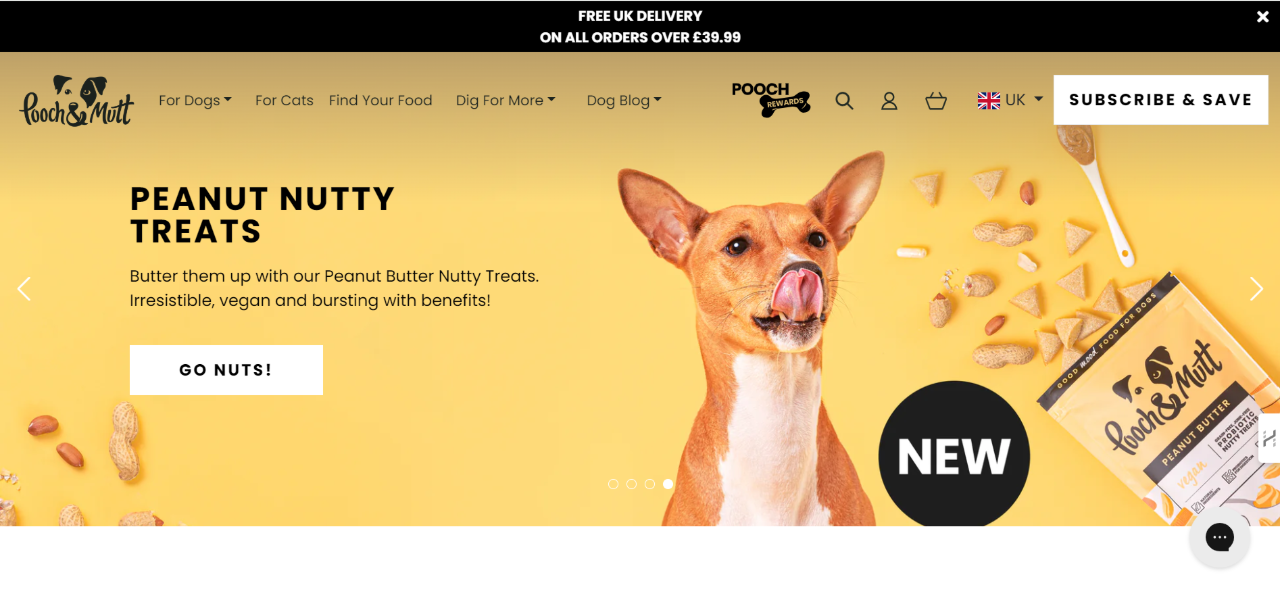
Pooch & Mutt's e-commerce site is a delightful feast for the eyes, especially for pet owners. The website uses a bright, engaging color scheme that perfectly captures the playful spirit of the brand, which specializes in healthy and natural pet foods. The design is not only visually appealing but also effectively communicates the brand's commitment to pet health and happiness.
Design Elements
- Color Scheme: The website features a vibrant yellow background that instantly grabs attention and evokes a sense of joy and energy, reflective of the lively nature of pets. This bold color choice sets a positive tone for the shopping experience.
- Typography: The site uses fun and friendly typography, which adds a whimsical touch and aligns well with the overall pet-friendly theme. The choice of fonts is readable and adds to the site’s approachable feel.
- Imagery: High-quality images of pets, along with the products, are prominently displayed. These images are not just decorative; they play a crucial role in showcasing the benefits of the products and their impact on pet health.
User Experience
Navigating the Pooch & Mutt site is a breeze with its well-organized layout and intuitive design. Key information about product benefits, such as "vet recommended" and "natural ingredients," is highlighted right on the homepage, making it easy for pet owners to make informed decisions about their purchases.
Unique Features
- Educational Content: The site provides valuable insights into the health benefits of its products, helping pet owners understand why these choices are beneficial for their pets. This educational approach is crucial for building trust and loyalty.
- Interactive Elements: Interactive quizzes or selectors help users find the most suitable products for their pets’ specific needs, enhancing the personalized shopping experience.
Pooch & Mutt’s website stands out in the e-commerce space with its lively design and user-focused features. By combining aesthetic appeal with functional design, the site effectively attracts pet owners and encourages them to explore and purchase products that promote pet health and well-being. This makes it a bright example of excellent e-commerce website aesthetics in 2024.
Section 8:
Overview of E-Commerce Platforms: Shopify and Wix
When setting up an online store, the choice of e-commerce platform can significantly impact the functionality, aesthetics, and overall success of the business. Among the plethora of options available today, Shopify and Wix stand out as two of the most popular and user-friendly platforms. Here's a breakdown of each to help you determine which might be best suited for your needs.
Shopify
Strengths:
- E-commerce Specialization: Shopify is a dedicated e-commerce platform designed specifically for online stores. It offers robust tools for managing inventory, processing payments, and handling shipping—all integral parts of running an online store.
- Scalability: Shopify scales excellently from small businesses to large enterprises. It supports unlimited products and has a wide range of themes and apps to enhance store functionality.
- Security: Shopify provides SSL certification and PCI compliance to ensure secure transactions, making it highly reliable for both merchants and customers.
Weaknesses:
- Cost: While Shopify offers a lot of functionality, its cost can add up. Aside from monthly fees, there are additional charges for many third-party apps and transaction fees unless you use Shopify Payments.
- Customization Complexity: While it's easy to set up a store with basic functionalities, significant customization requires familiarity with Shopify’s own coding language, Liquid.
Wix
Strengths:
- Ease of Use: Wix is known for its drag-and-drop interface that makes it extremely easy for beginners to design and launch an e-commerce site. This platform is ideal for small businesses or individuals who prioritize ease of design and setup over advanced e-commerce functionality.
- All-in-One Solution: Wix combines website hosting with website building, which includes e-commerce functionalities. This makes it a convenient option for small to medium-sized businesses.
- Cost-Effective: Wix offers a more straightforward pricing structure than Shopify, with fewer hidden costs. This can make it more appealing for startups and small businesses with tighter budgets.
Weaknesses:
- Scalability: Wix is not as robust as Shopify when it comes to scaling up a business. It’s more suited to smaller operations that do not require complex e-commerce functionalities.
- E-commerce Tools: While Wix has been improving its e-commerce capabilities, it still lacks some of the advanced tools and customizations offered by a dedicated platform like Shopify.
Choosing between Shopify and Wix often comes down to your specific business needs. If you're looking for a platform that can handle high-volume sales and complex e-commerce operations, Shopify is likely the better choice. However, if you are just starting out or have simpler needs, Wix’s user-friendly interface and cost-effective pricing may be more suitable.
Both platforms offer unique strengths that can help launch and grow your online store, so consider your long-term goals and the features that are most important for your business’s success when making your decision.
Conclusion
The visual appeal of an e-commerce website is crucial in attracting and retaining customers in today's digital marketplace. As we've explored through our top picks for 2024, each site brings its own unique flair, combining functionality with stunning aesthetics to enhance user experience and foster brand loyalty.
From Vinyl Collector's retro vibe to Pooch & Mutt's vibrant and engaging layout, these websites not only stand out visually but also effectively communicate their brand values and cater to the specific needs of their target audiences. They showcase how integrating strong visual elements with user-friendly design can result in a superior online shopping experience.
Furthermore, platforms like Shopify and Wix provide the tools necessary for businesses to create these compelling online environments. Whether your focus is on extensive e-commerce capabilities or user-friendly design, choosing the right platform is a foundational step in crafting a visually appealing and functional e-commerce site.
As we move forward, the importance of website aesthetics coupled with effective functionality will continue to grow. Businesses that invest in creating beautiful, intuitive, and responsive websites are likely to see greater engagement and conversions, proving that in the world of e-commerce, beauty is much more than skin deep—it's essential for success.